Hybrid office spaces allowing teams to make their mark

Ampers&
Space to make your mark
The office rental industry isn’t fit for modern ways of working. Ampersand combine the best features of conventional and serviced offices, and needed a brand to reflect this new hybrid offering.
A brand that owns and symbolises what it means to combine industry leading features and benefits into one solution, that businesses love.
SERVICES (DESIGNED AT ASCEND STUDIO)
Naming
Branding
Wayfinding
Digital design


After coming up with a name that communicated the story of the brand, the biggest challenge was not to over work the design. The idea is in the name, therefore simplicity was key.
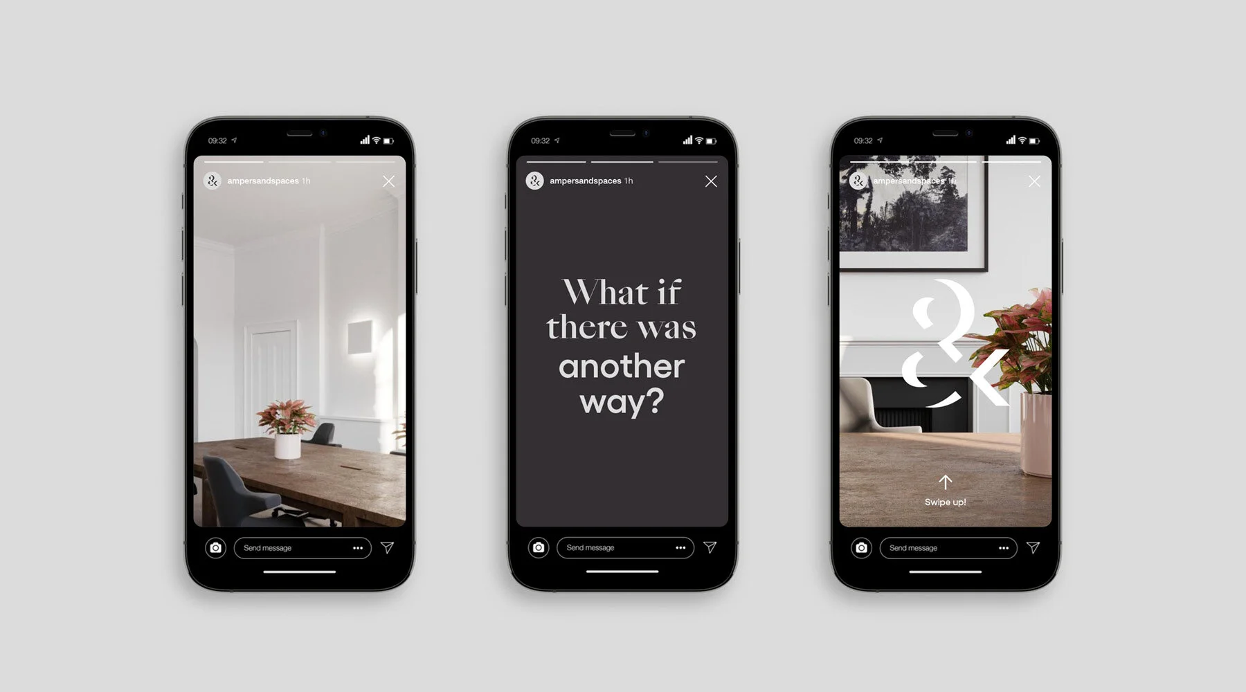
Having explored many ampersands, the best solution was a well crafted and simple logotype, supported by a logomark. The mark is designed with negative shapes to act as a window into the brand and spaces.


This OOH campaign was never created, but the simple typographic idea expanded on what the ampersand stood for – a visual metaphor for combining the brands features and benefits.


An idea that came about in the initial round of creative concepts was to create not one ampersand mark, but hundreds. This would communicate the way spaces can be suited to all characters. I came back to this idea when we started to create merchandise and promotional designs for the brand.


